
Hello everyone,
As I frequently get questions about the paper I use for my illustrations, I thought it would not be a bad idea to make an in-depth review of watercolour papers: the ones I have tried, whether I liked or disliked them and why, their caracteristics, and what you should pay attention to when looking for a good watercolor paper.
Keep in mind that all opinions are my personal ones, and refer to how I work - the right paper for me may not be the right paper for you, depending on your personal techniques. :)
Also, I use watercolour paper because I almost systematically mix markers with watercolour and thinned acrylics, but if you use markers only I would not recommend them - they suck the ink out like crazy.
Watercolour papers 101
Thickness
Papers come in different thicknesses that are described by their weights in grams per square meter (i.e. gsm). Usual printing paper is somewhere around 90gsm, and watercolour papers typically range from 185gm (thin) to 600gsm (very thick). I use 300gsm, which is the most easily found type of watercolour paper. If you are going to use very wet paint (watercolours, thinned acrylics, washes of ink, etc) I would not recommend using anything thinner than 300gsm, as the paper will wobble badly or even tear.
Grain
Watercolour papers can have different textures:
- rough grain (or "torchon"), which is a coarse, pronounced texture
- fine grain (cold-pressed paper, or NOT), your typical watercolour paper texture
- satin paper (hot-pressed), which is a very smooth, almost textureless paper.
Hot-pressed is my personal favourite by a long shot.
Fiber
Watercolour papers can be made from either wood or cotton fibers. Paper made from cotton is sometimes called "rag paper", and it is usually considered higher quality. If the fiber type is not stated, then it is safe to assume it's wood fiber. I personally like cotton papers much better, I find that they have a smoother surface and better absorbency (see below).
Archivality
Archivality refers to whether a paper is meant to last in time. Most papers contain acidic substances that, over time, will yellow the paper and degrade the colours of whatever is drawn on them. Archival papers are processed to remove acidic substances naturally present in wood pulp, and are made using a procedure involving different chemicals compared to regular papers. As a result, they are more pricey. Non-archival papers can be used for roughs, sketches, and designs that are not meant to last - but for any type of artwork you may want to keep or sell, I strongly suggest using archival paper. Most but not all watercolour papers are archival. This should usually be stated in the description - if the paper is described as acid-free and without optical brighteners, it should be archival.
Colour
Depending on the treatment of the paper, it may be more or less white. Archival papers do not contain optical brighteners, i.e. chemical compounds that make papers very white and bright. They are usually a twinge more on the ivory, warm side - some more than others.
Absorbency
Again, depending on the treatment of the paper, but also on the fiber type, papers may be more or less absorbent. Absorbent papers will soak wet paint or ink in quickly (although on a high-quality paper, the colour should not feather or bleed either). Water will stay on the surface a bit longer on a less abosorbent paper, and sometimes even "bead" (especially on papers containing a lot of gelatine). This is more difficult to assess without trying the paper first-hand, but less absorbent papers often have a slightly waxy, gummy touch, and look slightly less matte. I personnally hate waxy watercolour papers and stay the hell away from them (yes, that's how bad I feel about them).
Pads vs. Sheets
Most brands sell watercolour paper both as pads of various sizes, and as large individual sheets (usually 50x70cm). That is very much up to your personal preferences. I love pads and always have a number of A3 ones lying around, but I use sheets as well when I need to cut out a larger piece of paper for a drawing.
Stretching
Unless you are using your watercolour paper for a dry technique, watercolour paper should be stretched, i.e. taped to a stronger support (a piece of cardboard, plywood, your table, etc). This prevents the paper from wobbling and buckling when using a lot of water. I have heard that 600gsm paper does not need stretching but I have not tried myself, and am slightly skeptical about that. :)
On with the review!
Of course I have not tried out every single watercolour paper out there, so this is by no means exhaustive, but here you go.
These papers are pretty much ordered from my favourite to least favourite ones.

Arches watercolour paper is hands-down my favourite paper. It is known all around as one of the highest quality cotton papers you can find - and accordingly, one of the most expensives...
I have tried both the hot-pressed (which is my paper of choice) and torchon papers. Both are a superbly soft and absorbent surface on which pencils and colours glide beautifully. They are archival, and are a quite warm-toned, ivory-white colour (the warmest I have tried, I think). They come in pads and sheets - I tried and loved both.
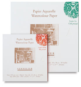
Sennelier paper is a close second to Arches. I have tried only the hot-pressed paper. Again, very high-quality archival cotton paper, very smooth, colours glide one perfectly. It is slightly less absorbent than the Arches, and whiter as well. I think they are only available as pads though.

This paper is an interesting choice is you are concerned by environment protection (although paper production is highly polluting, no matter what...). It is the art paper counterpart of the printing paper I use for my fine-art prints.

The very first watercolour paper I got when I was about 9! :D
I kept using Canson Montval for quite a while, but have not used it for years now (ever since I found out about hot-pressed paper). I used the fine-grained one, but it also comes in rough grain ("nuage"). It is a wood fiber paper, with a very white colour. The surface is quite scratchy, and not highly absorbent. It is acid-free but I am not sure about its archivality, as it may contain brighteners considering its colour. It comes in pads and sheets. Altogether a cheap paper that you may like for its price and texture, although I would not buy again anymore.
Daler Rowney Langton Prestige - my latest experiment and my least liked of the bunch. It is a cotton archival paper and comes in all three finishes (although I only tried the hot-pressed one). It is very white, and has a very waxy, poorly absorbent surface on which pencils do not hold very well, and that feels almost like Bristol board. I personally do not like that at all - but if you like these kind of surfaces where you can correct and retake colour easily, and have been looking for a sturdier, non-peeling alternative to Bristol, this may be for you. They come in pads only, and on the plus side, they are relatively cheap.
That's it folks!
Please feel free to comment on your personal preferences, and papers you would recommend! :)


I love the satin paper ones. I use the Fabriano Artistico one, on pads (which is my favourite one and the very best I've ever tried out). I would love to use the Arches one, but even if I live in Rome, is not really easy to find it, and on Internet it's too much expensive... :/
RépondreSupprimerHahnemühlee is a discover I made last year in Lausanne (do you remember? ^_^), and I felt in love... very nice review, by the way!
Thanks Claudia!
RépondreSupprimerI've heard people raving about Fabriano but it's not easy to find in France (not sure about the UK - I should check that out!).
Yes, Arches is very expensive, even in France... but so worth it, I keep buying it over and over again.
And Hahnemühle is lovely indeed! I didn't remember you were trying this one out in Lausanne! I gave away my pad when I moved because I just could not take all the paper I had with me, and I was storing my leftover stuff in a damp cellar so it made on sense to store paper there. I should get a new one. :D
Fabriano usually is amazing for every kind of paper, I love the sketch one, because of its texture: not rough as a canvas, neither too smooth as a normal sheet.
SupprimerAnyway the day we left Lausanne, before taking the train, I visited an amazing fine art supplies shop, and I found that Hahnemühle paper.
I have a couple of Arches pad, but they're both torchon grain, and I don't feel very comfortable with them, my technique doesn't fit very well, but I have to say that is an amazing paper, especially because of their amazing absorbency (they're not gummy at all!). Indeed, I cannot sell or give them away, even if I don't use them: I just love the fact I have these pads! XD
Arches is a very sexy paper indeed. A pleasure to use and looks so precious as well.
RépondreSupprimerI suppose (hope ?) I'm not the only one but whenever I go to buy new paper I feel the need to touch each and every one of the samples. I think you ough to have a paper you really understand an love because if you fight against the way it reacts to water or color there's no point using it.
Same goes for the colors you use (even though it often means paying quite a lot to get the perfect thing.)
I am also using Lana paper (satin as well), have you heard about it ? There's a factory very close to where I live (yay factory sales) and their watercolor cotton paper tends to look very similar to the Arches one.
Not sure it is cheaper though. Maybe a bit cheaper.
I've used Fabriano. The satin one I tried was not absorbant enough for my needs though.
Bratha, somebody else mentionned Lana as one of their favourites on Facebook... now I want to try it!! :D
RépondreSupprimerAnd I'm totally with you on the guilty pleasure of touching the samples when buying paper! Touch is often a good indication of whether a paper will work for you or not...!